
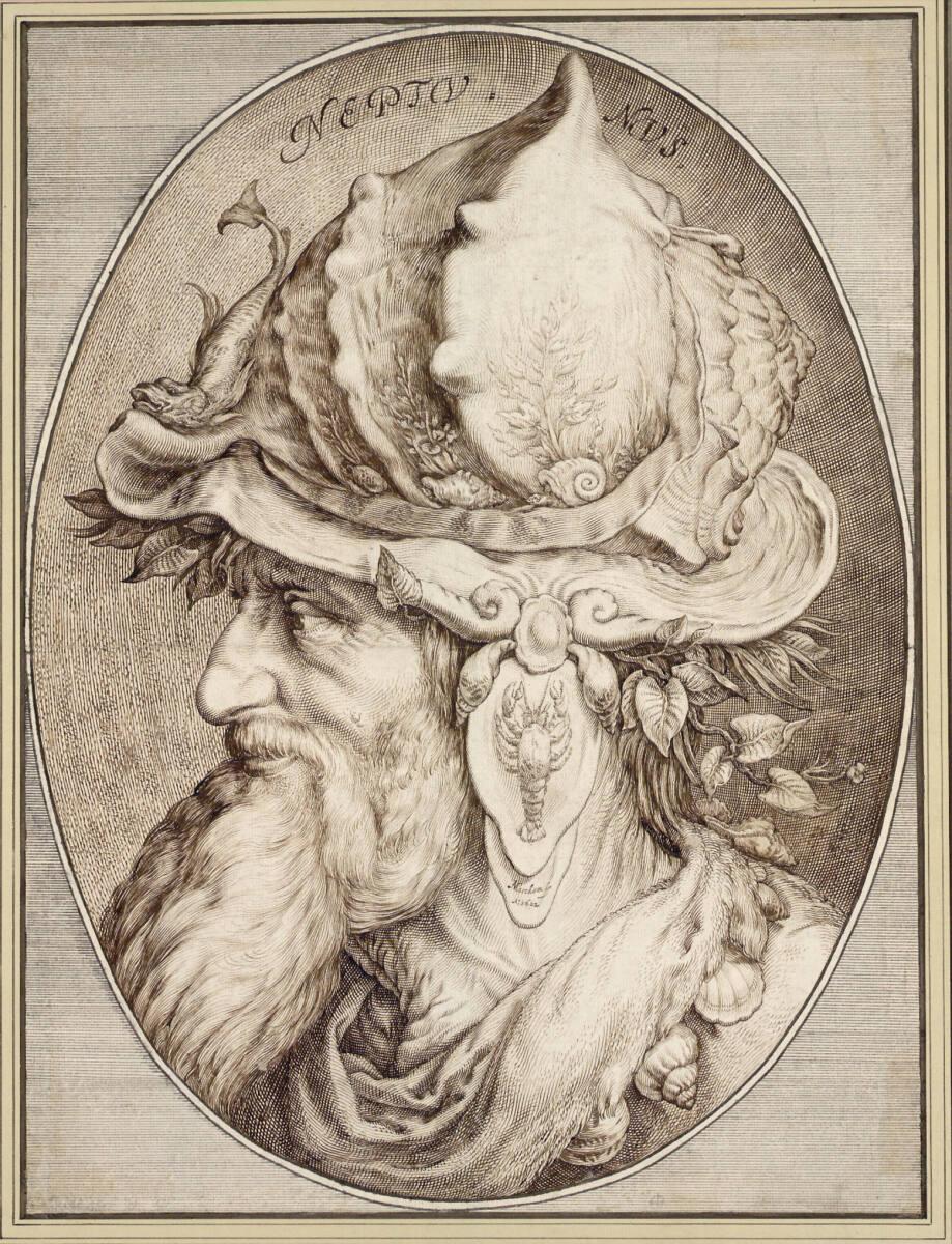

Neptun
Jacob Matham
1602
Jacob Matham’s (1571–1631) mother married the
esteemed Haarlem master Hendrick Goltzius
(1558–1617) when Matham was seven years old,
and his training and professional life were shaped
thereafter by his successful and illustrious stepfather.
Neptune is a showpiece of the artist’s skill,
made after he returned from a tour of Italy and
gained membership into the Guild of Saint Luke
in Haarlem. In a medallion that mimics a concave
mirror frame, he portrayed Neptune as a wizened
figure with a long beard, a large nose, and a fantastical
helmet in the shape of an enormous conch shell.
The shell is adorned with sea plants, snails, shells,
and a fish at the crest, while an elaborate earpiece
hanging down from the side depicts a lobsterlike
crustacean. Sea plants cushion the heavy shell
against the god’s head, and a string of shells forms a
necklace around his wrinkled neck.
The so-called fantastic head was a motif of
Italian Renaissance masters such as Michelangelo
(1475–1564) and Leonardo da Vinci (1452–1519),
but Matham’s inspiration can be traced closer
to Haarlem. Penwerk (penwork) was a technical
innovation in drawing advanced by Matham’s stepfather
Goltzius in the 1580s. It required a virtuosic
control of pen and ink to create swelled lines that
terminate in tapered points, drawn marks meant
to simulate the appearance (and burin-hand) of
engravings produced by Goltzius and his Haarlem
followers. Goltzius’s 1587 penwerk Head of Mercury
(fig. 1), now in Oxford, demonstrates the dot-accented
lozenges and absence of contour lines typical of the
technique.
Matham’s Neptune exhibits a bewildering array
of marks—all taken from engraving processes—to
create different effects and textures. He drew the
god’s face with multiple swelled lines that terminate
in points, producing the appearance of contour, and
crossed lines to form lozenges and thus volume,
lifting the face away from the patterned lines
of the background. The pointed end of lines is a
distinctive feature of the sheet, imitating the end of
a burin stroke lifted from the copperplate. Matham
achieved the distinctive texture of the conch shell
by drawing parallel lines and then filling the spaces
in between with shorter lines laid close against the
longer ones. This system of lines is reminiscent
of the innovative engravings of Lucas van Leyden
(1494–1533), who used a similar pattern of marks
to create volume. Flicks and dots throughout the
composition augment the linework to build contour
or texture as needed. Incredibly, no underdrawing
or stylus marks are apparent. Chalk or charcoal may
have been used sparingly and rubbed away. The
overall achievement of the drawing, and of the penwerk
technique in general, is in part its apparently
freehand execution, overtly devoid of preparation.
Matham’s subject, Neptune, had longstanding
associations with the seafaring merchant cities of
the Netherlands. The god of the sea appeared with
regularity in Netherlandish imagery throughout the
sixteenth and seventeenth centuries, for example,
in civic processions, architecture, and sculpture.
Prints and paintings depicting Neptune and other
gods populate the works of Matham’s generation
and of previous Haarlem masters such as Maarten
van Heemskerck (1498–1574). Neptune was especially
popular in decorative arts of the period. The
interplay of materials and textures in the sheet
mirrors that of objects such as jewelry pendants
that incorporate natural pearls with metalwork and
enameling (see fig. 2).
The variety of shells in the drawing and their
accurate rendering suggest that Matham benefited
from the presence in Haarlem of a collection of
shells owned by Goltzius’s friend, the textile merchant
Jan Govertsen van der Aer (1544/45–1612?).
Goltzius painted Van der Aer among his shell collection
in 1603 (fig. 3).1 Neptune was made the year
before Goltzius’s portrait of Van der Aer was completed,
and one could even propose a correlation
in the making of the two works. Further evidence
of Matham’s access to Van der Aer resides in the
existence of another penwerk sheet convincingly
attributed to Matham that portrays Van der Aer
himself in profile (fig. 4).2 While no evidence of a
patron for the Neptune exists, this sheet was apparently
admired, as Matham made another drawing
of Neptune, in reverse of the Albertina sheet and
with minor changes to ornament, in 1626.3
1. In 1616–17, Cornelis Cornelisz. van Haarlem (1562–1638)
painted Van der Aer in the guise of Neptune, surrounded by
shells: Allegory of the Arts, 1607, oil on canvas, 17.8 x 23.4 cm,
on loan to The National Trust, UK; Van Thiel 1999, 203.
2. Goltzius also made a chalk drawing of Van der Aer in 1606:
The Shell Collector Jan Govertsz. van der Aar, black and red chalks,
on pink prepared paper, 47.2 x 37.5 cm, Teylers Museum,
Haarlem, The Netherlands, KT 1984 009; Reznicek 1993, 65,
no. 275a.
3. Jacob Matham, Neptune, 1626, pen and brown ink, on paper,
46.5 x 36 cm, Staatliches Museum, Schwerin, 1512 HZ; see Luijten
and Van Suchtelen 1993, 567, fig. 239a.
Emily J. Peters, Laura M. Ritter (Hg.), AK Tales of the City. Drawing in the Netherlands from Bosch to Bruegel, Cleveland Museum of Art 9.10.2022 - 8.1.2023, New Haven 2022, Kat. Nr. 88
Dass Jacob Matham als Kupferstecher wie als Zeichner unter dem Einfluss seines Stiefvaters und Lehrers Hendrick Goltzius stand, zeigt sich besonders in der vorliegenden Federarbeit. In monumentalem Format stellt Matham den Meeresgott Neptun dar, dessen markanten, bärtigen Profilkopf er in der Art des Italieners Giuseppe Arcimboldo (1526–1593) mit einem skurrilen Fantasiehelm in Gestalt einer überdimensionalen Muschel versehen hat. Diese ungewöhnliche Kopfbedeckung ist mit einer Fülle von Schalentieren, Schnecken und Meerespflanzen sowie einem Fisch dekoriert. Auf der geschwungen geformten Ohrbedeckung haftet ein Krustentier; zwischen den schulterlangen Haaren des alten Mannes quellen Seepflanzen hervor, und um seinen faltenreichen Hals schmiegt sich eine Muschelkette.
In der Ausführung des Neptun schließt der Künstler an die von Goltzius entwickelte, höchst virtuose Technik der »penwercken « an. In solchen Federkunststücken werden – in bewusster Analogie zum Kupferstichverfahren–durch parallel fließende, einander mehrfach kreuzende Linien äußerst differenzierte Oberflächenwirkungen und Helldunkelwerte erzielt; Schattierungen werden durch kurze, dicht gesetzte Striche vermittelt. Was ein Blatt wie Neptun von der gleichmäßig scharf gedruckten Lineatur der Kupferstiche unterscheidet, ist die individuelle Qualität der lebhaft an- und abschwellenden Linien. Mit dieser Einmaligkeit erhebt jedes Federkunststück den Anspruch auf Kostbarkeit und Exklusivität.
Bosch, Bruegel, Rubens, Rembrandt. Meisterwerke der Albertina, hg. von K. A. Schröder und C. Metzger, Albertina, Wien, Ostfildern 2013, Abb. 91, S. 194.


